135 years of work at your fingertips
In 1857, the members of the Philological Society of London decided that existing English language dictionaries were incomplete and called for a complete re-examination of the language. Whilst they knew this was a massive undertaking, they didn't realize the full extent of work involved or how long it would take.
After making painfully slow progress, in 1879, the Society enlisted the Oxford University Press who begin work on a New English Dictionary, the Oxford English Dictionary. The new dictionary was planned as a series of volumes totalling 6,400 pages and was completed in 1884.
Fast-forward to 2019 and we are fortunate that we no longer have to trawl through over 6,400 pages of words and descriptions to find what we're looking for.
The feature
I've been working on a side project called Internote. Internote is a distraction-free web-based text editor with a focus on effortless design and slick user experience.
As Internote is a side-project, I'm free to design and build features that I personally find useful. One of the features that I wish more editors have is an integrated thesaurus and dictionary that is easy to access. Writing is not my forte, but fortunately I know how to code and as it turns out, the Oxford University Press expose their famous dictionary over a HTTP API for a small fee.
I wanted to integrate the dictionary in to the product and allow it to be accessible as easily as possible.

The experience
Before I start any visual design or code, I always start a feature with the user journey. The guiding principle behind every experience in Internote is powerful, effortless and distraction-free, and I wanted the dictionary to be unimposing and available only when needed.
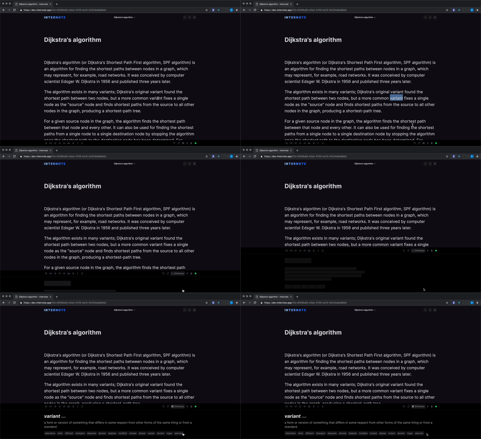
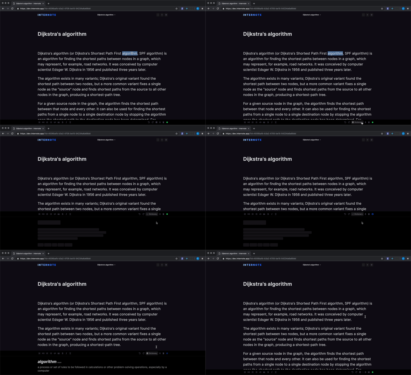
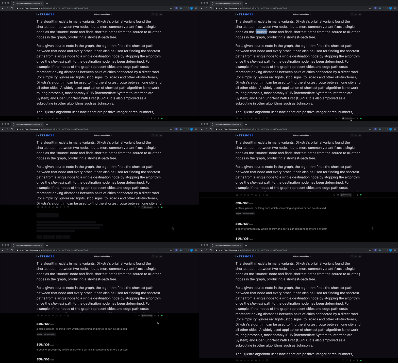
I chose to place the dictionary feature alongside the other editor toolbar controls like undo, redo and delete. I used a familiar icon button combo that you can read more about here. Upon clicking the dictionary button, a tray appears from below with a simple description and list of synonyms for the selected word. Tapping the button again closes the tray, tapping a synonym replaces the highlighted word with the synonym. This simple design allows the feature to be tucked away, but available quickly and effortlessly.
Following the usability principle flexibility and efficiency of use, I wanted to make the feature even more easily accessible. All good text editors have very well designed keyboard shortcuts and Internote is no exception! I added shortcuts for ctrl+d to open the dictionary and esc to close it. The full power of the Oxford English Dictionary is truly available under your fingertips.
The visuals
Once the user journey and experience was settled, I moved on to the visuals. Internote has a fairly simple pallette of dark, subdued colours, simple iconography / typography and I'm a big proponent of consistency - I wasn't plannign on reinventing the wheel here.
The part that took the longest to design was how and where the dictionary results would display. I had two good options. The first being a pop-over that displays close to the selected word. This is the option that OSX & iOS use, however since the primary control for initiating Internote's dictionary is towards the bottom of the screen, I thought it would be strange for the user to move their attention to the bottom of the screen, and then back up to the word they selected to see the results. I went for the second option, a tray that appears near the button.

The second part that took a while to design was what to show to the user when the results are loading. I'm not a massive fan of loading spinners and have tried to avoid them in Internote. I'm a big fan of loading UIs that show loading indicators in place of interface elements (these are sometimes referred to as skeleton screens). This technique worked particularly well for this feature as the skeleton screen lets the user know where the results will appear when they are ready. The user becomes familiar with the layout ahead of time. The animation used on the expanding tray in combination with the skeleton screen gives the user a sense of perceived speed and makes the loading feel quicker.
Once I had the design in mind, I created the React components I needed.
The build
I was pleasantly surprised to learn that the Oxford University Press not only published an API, but it followed fairly modern API practices, and is mostly restful. From the UI design and build, I had a rough data-structure in mind for the API response. The back-end was a simple proxy for the Oxford Dictionary API that performed some data massaging that made it easier for the front-end to conosume. Unfortunately, three API endpoints were needed to be used to gather all of the data necessary for the front-end to render the results.
Since Internote is a serverless application when the request from the front-end comes in, a new server spins up in AWS lambda, takes the request, calls the Oxford Dictionary API endpoints, transforms the results and sends the response back to the front-end.
The result

I'm really pleased with how the dictionary feature turned out, and it only took a few evenings to create thanks to the well documented Oxford Dictionary API and the tech-stack I have used to build Internote in.