A unique approach to tooltips
I've been working on a side project called Internote. Internote is a distraction-free web-based text editor with a focus on effortless design and slick user experience.
Internote is a side project which means I have complete control over features, design, user experience and code. It means that I'm free to experiment with technology and design that I am not usually tasked with such as serverless, devops and yes ... tooltips.
Tooltips
Since Internote is a designed as a distraction-free editor - clear iconography is really important as iconography is able to communicate using much less precious screen real-estate than text does.
Many of Internote's icons double up as buttons. For example, in Internote's header there are buttons for full-screen mode, creating new notes and accessing settings. Whilst the icons do a pretty decent job of explaining the intention behind the action at a glance, they often require a text explanation to make it crystal clear.
Whenever I use an app that utilises iconography for initiating actions, such as Google's suite of apps, I often hover over over an icon that I think is the right tool for my current task, and I wait for a little tooltip to appear to confirm I'm on the right track because I don't want to click something that isn't what I want and be forced to go backwards to get to where I was. In usability heuristics, this is known as recognition rather than recall.
I felt inspired to try a new UX approach to tooltips:
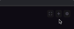
I decided to combine two UI components in to one with an interaction that morphs between them. In it's inactive state, the icon does quite a good job of saying I might be the thing you need, upon hover, the icon expands in to a button and reveals a tooltip that clearly states the intention of the button.
I've been having a lot of fun exploring unique UI/UX design with Internote, and tooltips were a particularly fun one.